Note
Go to the end to download the full example code
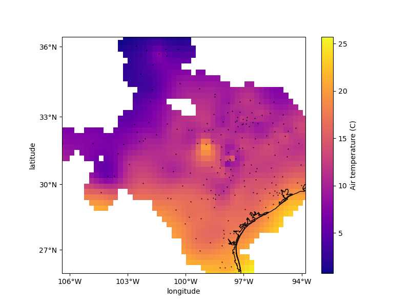
Gridding with splines#
Biharmonic spline interpolation is based on estimating vertical forces acting
on an elastic sheet that yield deformations in the sheet equal to the observed
data. The results are similar to using verde.Cubic but the
interpolation is usually a bit slower. However, the advantages of using
verde.Spline are that the method is able to extrapolate outside of the
convex hull of the data points and we can assign weights to the data and do
model evaluation.
Note
Scoring on a single split of the data can be highly dependent on the
random_state. See Model Selection for more information and a
better approach.
Chain(steps=[('mean',
              BlockReduce(reduction=<function mean at 0x7f280b5794f0>,
                          spacing=27750.0)),
             ('spline', Spline(damping=1e-10, mindist=0))])
/usr/share/miniconda/envs/test/lib/python3.12/site-packages/verde/blockreduce.py:179: FutureWarning: The provided callable <function mean at 0x7f280b5753a0> is currently using DataFrameGroupBy.mean. In a future version of pandas, the provided callable will be used directly. To keep current behavior pass the string "mean" instead.
  blocked = pd.DataFrame(columns).groupby("block").aggregate(reduction)
/usr/share/miniconda/envs/test/lib/python3.12/site-packages/verde/blockreduce.py:236: FutureWarning: The provided callable <function mean at 0x7f280b5753a0> is currently using DataFrameGroupBy.mean. In a future version of pandas, the provided callable will be used directly. To keep current behavior pass the string "mean" instead.
  grouped = table.groupby("block").aggregate(self.reduction)
/home/runner/work/verde/verde/doc/gallery_src/spline.py:67: FutureWarning: The default scoring will change from R² to negative root mean squared error (RMSE) in Verde 2.0.0. This may change model selection results slightly.
  score = chain.score(*test)

Score: 0.825
<xarray.Dataset> Size: 18kB
Dimensions:      (latitude: 43, longitude: 51)
Coordinates:
  * latitude     (latitude) float64 344B 25.91 26.16 26.41 ... 35.91 36.16 36.41
  * longitude    (longitude) float64 408B -106.4 -106.1 -105.9 ... -94.06 -93.8
Data variables:
    temperature  (latitude, longitude) float64 18kB nan nan nan ... nan nan nan
Attributes:
    metadata:  Generated by Chain(steps=[('mean',\n              BlockReduce(...
import cartopy.crs as ccrs
import matplotlib.pyplot as plt
import numpy as np
import pyproj

import verde as vd

# We'll test this on the air temperature data from Texas
data = vd.datasets.fetch_texas_wind()
coordinates = (data.longitude.values, data.latitude.values)
region = vd.get_region(coordinates)

# Use a Mercator projection for our Cartesian gridder
projection = pyproj.Proj(proj="merc", lat_ts=data.latitude.mean())

# The output grid spacing will 15 arc-minutes
spacing = 15 / 60

# Now we can chain a blocked mean and spline together. The Spline can be
# regularized by setting the damping coefficient (should be positive).
chain = vd.Chain(
    [
        ("mean", vd.BlockReduce(np.mean, spacing=spacing * 111e3)),
        ("spline", vd.Spline(damping=1e-10)),
    ]
)
print(chain)

# We can evaluate model performance by splitting the data into a training and
# testing set. We'll use the training set to grid the data and the testing set
# to validate our spline model.
train, test = vd.train_test_split(
    projection(*coordinates), data.air_temperature_c, random_state=0
)

# Fit the model on the training set
chain.fit(*train)

# And calculate an R^2 score coefficient on the testing set. The best possible
# score (perfect prediction) is 1. This can tell us how good our spline is at
# predicting data that was not in the input dataset.
score = chain.score(*test)
print("\nScore: {:.3f}".format(score))

# Now we can create a geographic grid of air temperature by providing a
# projection function to the grid method and mask points that are too far from
# the observations
grid_full = chain.grid(
    region=region,
    spacing=spacing,
    projection=projection,
    dims=["latitude", "longitude"],
    data_names="temperature",
)
grid = vd.distance_mask(
    coordinates, maxdist=3 * spacing * 111e3, grid=grid_full, projection=projection
)
print(grid)

# Plot the grid and the original data points
plt.figure(figsize=(8, 6))
ax = plt.axes(projection=ccrs.Mercator())
ax.set_title("Air temperature gridded with biharmonic spline")
ax.plot(*coordinates, ".k", markersize=1, transform=ccrs.PlateCarree())
tmp = grid.temperature.plot.pcolormesh(
    ax=ax, cmap="plasma", transform=ccrs.PlateCarree(), add_colorbar=False
)
plt.colorbar(tmp).set_label("Air temperature (C)")
# Use an utility function to add tick labels and land and ocean features to the
# map.
vd.datasets.setup_texas_wind_map(ax, region=region)
plt.show()
Total running time of the script: (0 minutes 1.428 seconds)