Note
Click here to download the full example code
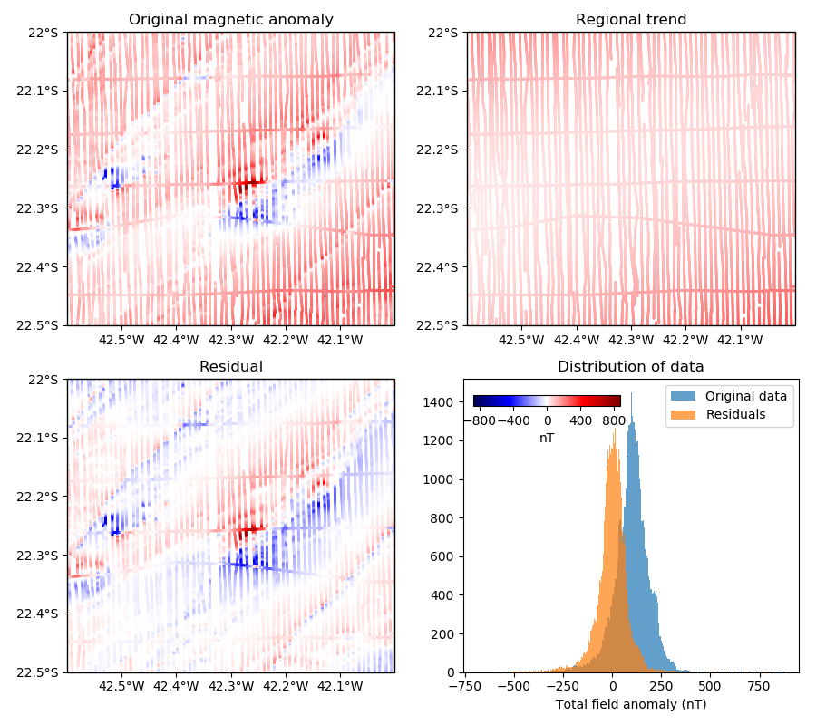
Polynomial trend
Verde offers the verde.Trend class to fit a 2D polynomial trend to your data.
This can be useful for isolating a regional component of your data, for example, which
is a common operation for gravity and magnetic data. Let’s look at how we can use Verde
to remove the clear positive trend from the Rio de Janeiro magnetic anomaly data.
Out:
Original data:
   longitude   latitude     ...       line_type  line_number
0 -42.590424 -22.499878     ...            LINE         2902
1 -42.590485 -22.498978     ...            LINE         2902
2 -42.590530 -22.498077     ...            LINE         2902
3 -42.590591 -22.497177     ...            LINE         2902
4 -42.590652 -22.496277     ...            LINE         2902

[5 rows x 6 columns]

Trend estimator: Trend(degree=2)

Updated DataFrame:
   longitude   latitude    ...          trend   residual
0 -42.590424 -22.499878    ...      93.929614  21.480386
1 -42.590485 -22.498978    ...      93.350509  27.999491
2 -42.590530 -22.498077    ...      92.778689  35.511311
3 -42.590591 -22.497177    ...      92.205282  41.034718
4 -42.590652 -22.496277    ...      91.634731  44.545269

[5 rows x 8 columns]
import numpy as np
import matplotlib.pyplot as plt
import cartopy.crs as ccrs
import verde as vd

# Load the Rio de Janeiro total field magnetic anomaly data as a pandas.DataFrame
data = vd.datasets.fetch_rio_magnetic()
print("Original data:")
print(data.head())

# Fit a 2nd degree 2D polynomial to the anomaly data
coordinates = (data.longitude, data.latitude)
trend = vd.Trend(degree=2).fit(coordinates, data.total_field_anomaly_nt)
print("\nTrend estimator:", trend)

# Add the estimated trend and the residual data to the DataFrame
data["trend"] = trend.predict(coordinates)
data["residual"] = data.total_field_anomaly_nt - data.trend
print("\nUpdated DataFrame:")
print(data.head())


# Make a function to plot the data using the same colorbar
def plot_data(column, i, title):
    "Plot the column from the DataFrame in the ith subplot"
    crs = ccrs.PlateCarree()
    ax = plt.subplot(2, 2, i, projection=ccrs.Mercator())
    ax.set_title(title)
    # Set vmin and vmax to the extremes of the original data
    maxabs = vd.maxabs(data.total_field_anomaly_nt)
    mappable = ax.scatter(
        data.longitude,
        data.latitude,
        c=data[column],
        s=1,
        cmap="seismic",
        vmin=-maxabs,
        vmax=maxabs,
        transform=crs,
    )
    # Set the proper ticks for a Cartopy map
    vd.datasets.setup_rio_magnetic_map(ax)
    return mappable


plt.figure(figsize=(9, 8))

# Plot the data fields and capture the mappable returned by scatter to use for
# the colorbar
mappable = plot_data("total_field_anomaly_nt", 1, "Original magnetic anomaly")
plot_data("trend", 2, "Regional trend")
plot_data("residual", 3, "Residual")

# Make histograms of the data and the residuals to show that the trend was
# removed
ax = plt.subplot(2, 2, 4)
ax.set_title("Distribution of data")
ax.hist(data.total_field_anomaly_nt, bins="auto", alpha=0.7, label="Original data")
ax.hist(data.residual, bins="auto", alpha=0.7, label="Residuals")
ax.legend()
ax.set_xlabel("Total field anomaly (nT)")

# Add a single colorbar on top of the histogram plot where there is some space
cax = plt.axes((0.58, 0.44, 0.18, 0.015))
cb = plt.colorbar(
    mappable, cax=cax, orientation="horizontal", ticks=np.arange(-800, 801, 400)
)
cb.set_label("nT")

plt.tight_layout()
plt.show()
Total running time of the script: ( 0 minutes 1.452 seconds)