2. Extend a region on all sides#
Sometimes, we have the values of a region (bounding box) that contains our data
and need to pad it on all sides for some reason. This could be the boundaries of
a plot or map that we’re making, or a larger region of influence that needs to
be considered, or something else. Bordado offers bordado.pad_region to
do this for you in n-dimensions.
import ensaio
import pygmt
import pandas as pd
import bordado as bd
Let’s illustrate this using a sample dataset of ground-based
gravity observations across Southern Africa which we’ll download with
ensaio.fetch_southern_africa_gravity and open with pandas.read_csv:
fname = ensaio.fetch_southern_africa_gravity(version=1)
data = pd.read_csv(fname)
data
| longitude | latitude | height_sea_level_m | gravity_mgal | |
|---|---|---|---|---|
| 0 | 18.34444 | -34.12971 | 32.2 | 979656.12 |
| 1 | 18.36028 | -34.08833 | 592.5 | 979508.21 |
| 2 | 18.37418 | -34.19583 | 18.4 | 979666.46 |
| 3 | 18.40388 | -34.23972 | 25.0 | 979671.03 |
| 4 | 18.41112 | -34.16444 | 228.7 | 979616.11 |
| ... | ... | ... | ... | ... |
| 14354 | 21.22500 | -17.95833 | 1053.1 | 978182.09 |
| 14355 | 21.27500 | -17.98333 | 1033.3 | 978183.09 |
| 14356 | 21.70833 | -17.99166 | 1041.8 | 978182.69 |
| 14357 | 21.85000 | -17.95833 | 1033.3 | 978193.18 |
| 14358 | 21.98333 | -17.94166 | 1022.6 | 978211.38 |
14359 rows × 4 columns
We can then use get_region to find the exact bounding box
of the data:
coordinates = (data.longitude, data.latitude)
region = bd.get_region(coordinates)
print(region)
(11.90833, 32.74667, -34.996, -17.33333)
If we plot the data using this bounding box, it may not look very good since
some data points will be exactly at the boundary. Let’s make a quick map of the
point locations with pygmt and the region that we found above:
fig = pygmt.Figure()
fig.coast(region=region, projection="M20c", land="#cccccc", frame=True)
fig.plot(x=data.longitude, y=data.latitude, style="c0.1c", fill="maroon")
fig.show()
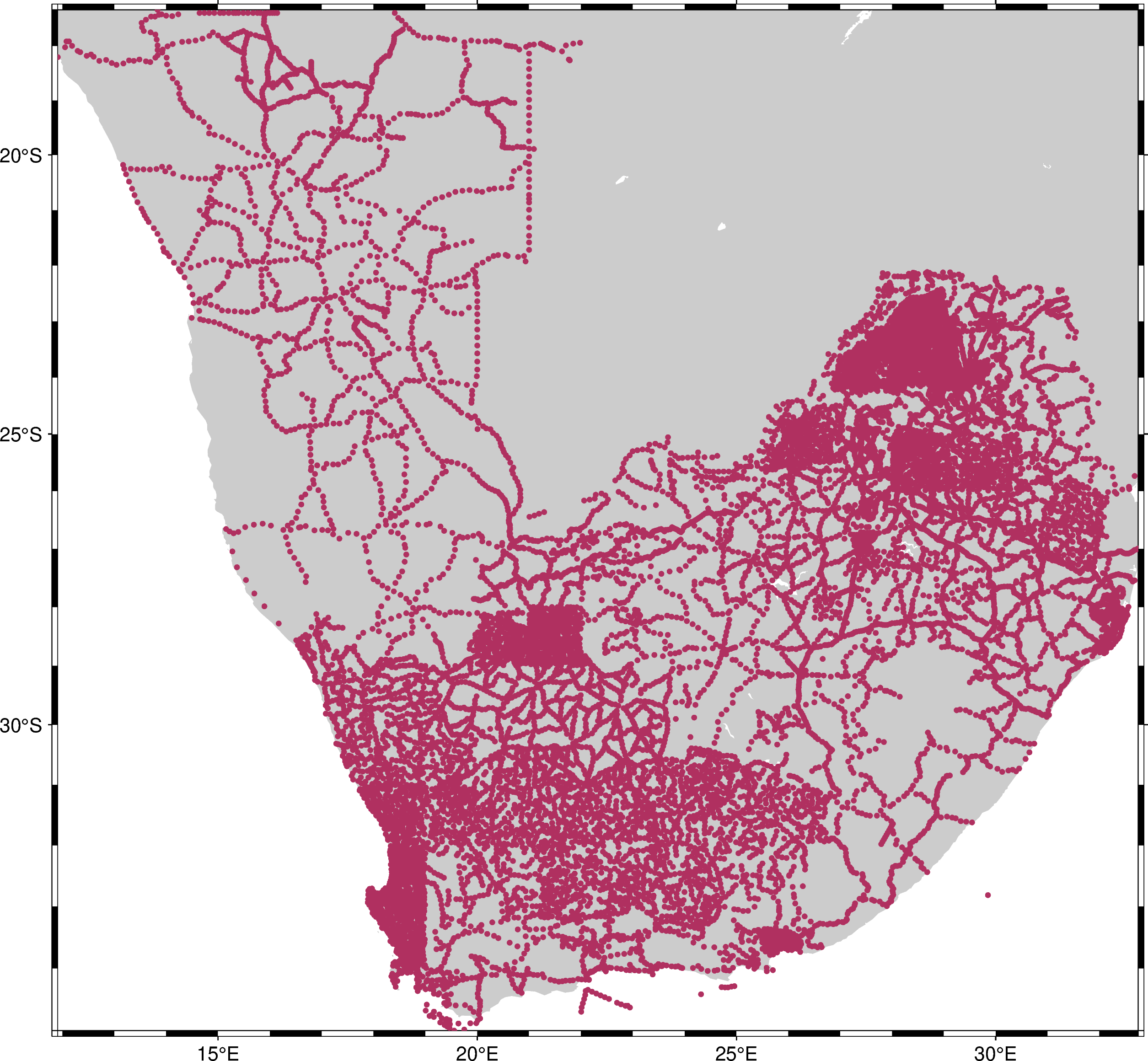
The points are where we have data. But when we use the exact region, the map
boundaries are touching some of the points, making it more difficult to see them
all. The map would be better if we padded the region a bit on all sides. Let’s
add some padding of 1.5° to each side using pad_region:
region_pad = bd.pad_region(region, pad=1.5)
print("Original:", region)
print("Padded:", region_pad)
Original: (11.90833, 32.74667, -34.996, -17.33333)
Padded: (10.40833, 34.24667, -36.496, -15.83333)
Now let’s make a new map with the padded region:
fig = pygmt.Figure()
fig.coast(region=region_pad, projection="M20c", land="#cccccc", frame=True)
fig.plot(x=data.longitude, y=data.latitude, style="c0.1c", fill="maroon")
fig.show()
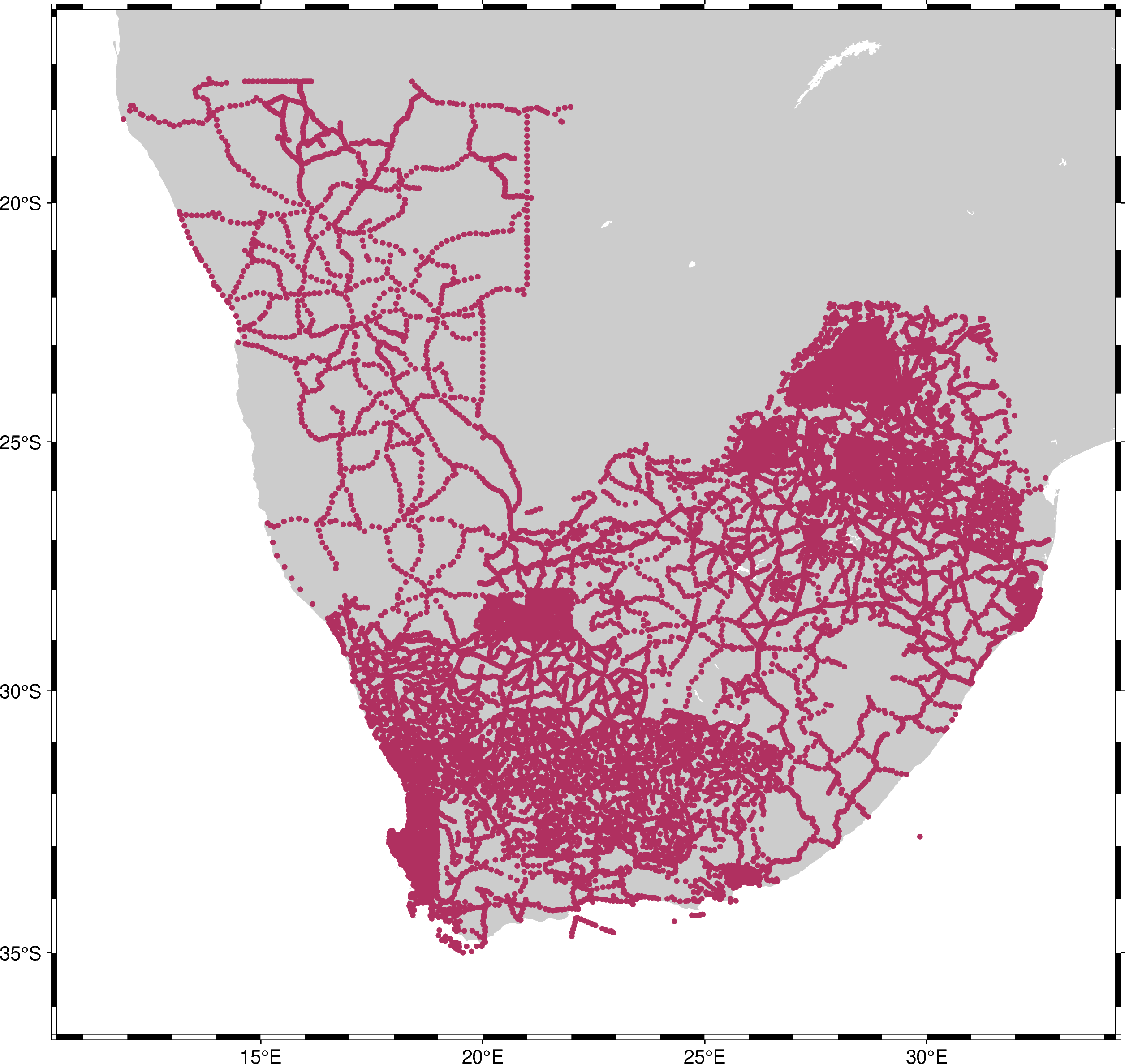
That’s better! Now we can see the full outline of the survey.