Note
Click here to download the full example code
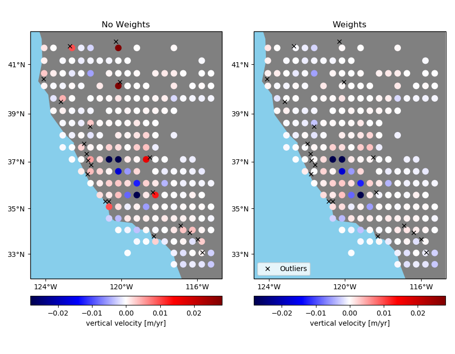
Using weights in blocked reduction
Sometimes data has outliers or less reliable points that might skew a blocked mean or
even a median. If the reduction function can take a weights argument, like
numpy.average, you can pass in weights to verde.BlockReduce to lower the
influence of the offending data points. However, verde.BlockReduce can’t
produce weights for the blocked data (for use by a gridder, for example). If you want to
produced blocked weights as well, use verde.BlockMean.
Out:
Index of outliers: [1608 2347 1099 2408  674  433 1071 2452  124 1219 1126  938  875   51
 2407  892  255 1349 1112 1326]
import matplotlib.pyplot as plt
import cartopy.crs as ccrs
import numpy as np
import verde as vd

# We'll test this on the California vertical GPS velocity data
data = vd.datasets.fetch_california_gps()

# We'll add some random extreme outliers to the data
outliers = np.random.RandomState(2).randint(0, data.shape[0], size=20)
data.velocity_up[outliers] += 0.08
print("Index of outliers:", outliers)

# Create an array of weights and set the weights for the outliers to a very low value
weights = np.ones_like(data.velocity_up)
weights[outliers] = 1e-5

# Now we can block average the points with and without weights to compare the outputs.
reducer = vd.BlockReduce(reduction=np.average, spacing=30 / 60, center_coordinates=True)
coordinates, no_weights = reducer.filter(
    (data.longitude, data.latitude), data.velocity_up
)
__, with_weights = reducer.filter(
    (data.longitude, data.latitude), data.velocity_up, weights
)

# Now we can plot the data sets side by side on Mercator maps
fig, axes = plt.subplots(
    1, 2, figsize=(9, 7), subplot_kw=dict(projection=ccrs.Mercator())
)
titles = ["No Weights", "Weights"]
crs = ccrs.PlateCarree()
maxabs = vd.maxabs(data.velocity_up)
for ax, title, velocity in zip(axes, titles, (no_weights, with_weights)):
    ax.set_title(title)
    # Plot the locations of the outliers
    ax.plot(
        data.longitude[outliers],
        data.latitude[outliers],
        "xk",
        transform=crs,
        label="Outliers",
    )
    # Plot the block means and saturate the colorbar a bit to better show the
    # differences in the data.
    pc = ax.scatter(
        *coordinates,
        c=velocity,
        s=70,
        transform=crs,
        cmap="seismic",
        vmin=-maxabs / 3,
        vmax=maxabs / 3
    )
    cb = plt.colorbar(pc, ax=ax, orientation="horizontal", pad=0.05)
    cb.set_label("vertical velocity [m/yr]")
    vd.datasets.setup_california_gps_map(ax)
ax.legend(loc="lower left")
plt.tight_layout()
plt.show()
Total running time of the script: ( 0 minutes 0.233 seconds)