Note
Click here to download the full example code
Trend Estimation
Trend estimation and removal is a common operation, particularly when dealing
with geophysical data. Moreover, some of the interpolation methods, like
verde.Spline, can struggle with long-wavelength trends in the data.
The verde.Trend class fits a 2D polynomial trend of arbitrary degree
to the data and can be used to remove it.
import matplotlib.pyplot as plt
import cartopy.crs as ccrs
import numpy as np
import verde as vd
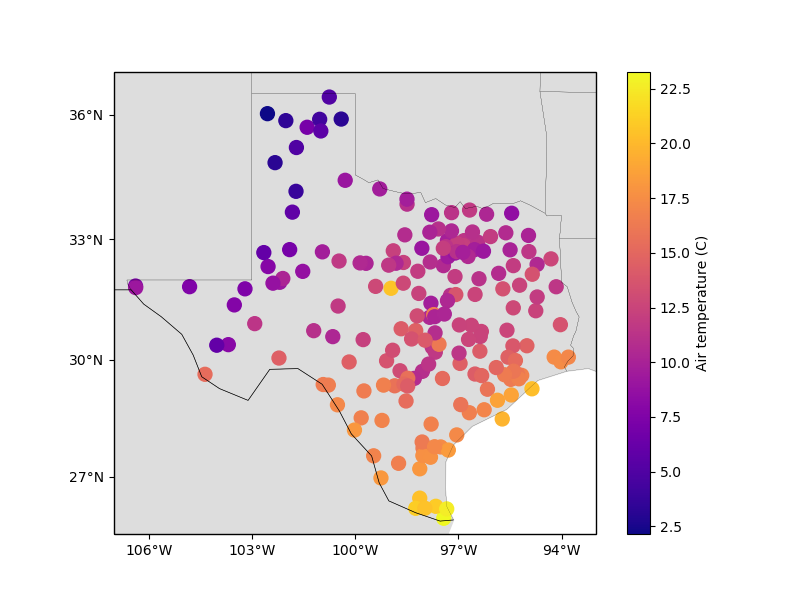
Our sample air temperature data from Texas has a clear trend from land to the ocean:
data = vd.datasets.fetch_texas_wind()
coordinates = (data.longitude, data.latitude)

plt.figure(figsize=(8, 6))
ax = plt.axes(projection=ccrs.Mercator())
plt.scatter(
    data.longitude,
    data.latitude,
    c=data.air_temperature_c,
    s=100,
    cmap="plasma",
    transform=ccrs.PlateCarree(),
)
plt.colorbar().set_label("Air temperature (C)")
vd.datasets.setup_texas_wind_map(ax)
plt.show()
Out:
/home/leo/src/verde/tutorials/trends.py:34: UserWarning: Matplotlib is currently using agg, which is a non-GUI backend, so cannot show the figure.
  plt.show()
We can estimate the polynomial coefficients for this trend:
trend = vd.Trend(degree=1).fit(coordinates, data.air_temperature_c)
print(trend.coef_)
Out:
[102.4946959 0.44373823 -1.48922224]
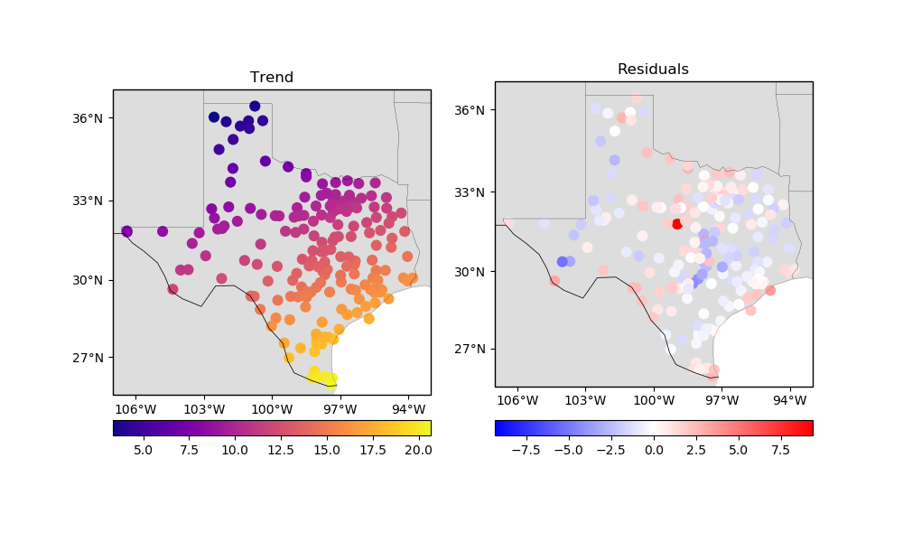
More importantly, we can predict the trend values and remove them from our data:
trend_values = trend.predict(coordinates)
residuals = data.air_temperature_c - trend_values

fig, axes = plt.subplots(
    1, 2, figsize=(10, 6), subplot_kw=dict(projection=ccrs.Mercator())
)

ax = axes[0]
ax.set_title("Trend")
tmp = ax.scatter(
    data.longitude,
    data.latitude,
    c=trend_values,
    s=60,
    cmap="plasma",
    transform=ccrs.PlateCarree(),
)
plt.colorbar(tmp, ax=ax, orientation="horizontal", pad=0.06)
vd.datasets.setup_texas_wind_map(ax)

ax = axes[1]
ax.set_title("Residuals")
maxabs = vd.maxabs(residuals)
tmp = ax.scatter(
    data.longitude,
    data.latitude,
    c=residuals,
    s=60,
    cmap="bwr",
    vmin=-maxabs,
    vmax=maxabs,
    transform=ccrs.PlateCarree(),
)
plt.colorbar(tmp, ax=ax, orientation="horizontal", pad=0.08)
vd.datasets.setup_texas_wind_map(ax)
plt.tight_layout()
plt.show()
Out:
/home/leo/src/verde/tutorials/trends.py:80: UserWarning: Tight layout not applied. The left and right margins cannot be made large enough to accommodate all axes decorations.
  plt.tight_layout()
/home/leo/src/verde/tutorials/trends.py:81: UserWarning: Matplotlib is currently using agg, which is a non-GUI backend, so cannot show the figure.
  plt.show()
The fitting, prediction, and residual calculation can all be done in a single step
using the filter method:
# filter always outputs coordinates and weights as well, which we don't need and will
# ignore here.
__, res_filter, __ = vd.Trend(degree=1).filter(coordinates, data.air_temperature_c)

print(np.allclose(res_filter, residuals))
Out:
True
Additionally, verde.Trend implements the gridder interface
and has the grid and profile methods.
Total running time of the script: ( 0 minutes 0.302 seconds)