Note
Click here to download the full example code
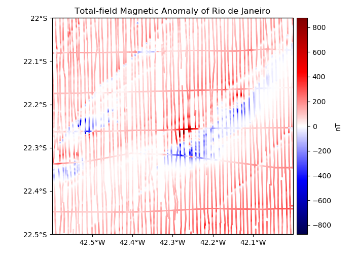
Magnetic data from Rio de Janeiro
We provide sample total-field magnetic anomaly data from an airborne survey of Rio de
Janeiro, Brazil, from the 1970s. The data are made available by the Geological Survey of
Brazil (CPRM) through their GEOSGB portal. See the
documentation for verde.datasets.fetch_rio_magnetic for more details.
Out:
longitude   latitude     ...       line_type  line_number
0 -42.590424 -22.499878     ...            LINE         2902
1 -42.590485 -22.498978     ...            LINE         2902
2 -42.590530 -22.498077     ...            LINE         2902
3 -42.590591 -22.497177     ...            LINE         2902
4 -42.590652 -22.496277     ...            LINE         2902

[5 rows x 6 columns]
import matplotlib.pyplot as plt
import cartopy.crs as ccrs
import numpy as np
import verde as vd

# The data are in a pandas.DataFrame
data = vd.datasets.fetch_rio_magnetic()
print(data.head())

# Make a Mercator map of the data using Cartopy
crs = ccrs.PlateCarree()
plt.figure(figsize=(7, 5))
ax = plt.axes(projection=ccrs.Mercator())
ax.set_title("Total-field Magnetic Anomaly of Rio de Janeiro")
# Since the data is diverging (going from negative to positive) we need to center our
# colorbar on 0. To do this, we calculate the maximum absolute value of the data to set
# vmin and vmax.
maxabs = vd.maxabs(data.total_field_anomaly_nt)
# Cartopy requires setting the projection of the original data through the transform
# argument. Use PlateCarree for geographic data.
plt.scatter(
    data.longitude,
    data.latitude,
    c=data.total_field_anomaly_nt,
    s=1,
    cmap="seismic",
    vmin=-maxabs,
    vmax=maxabs,
    transform=crs,
)
plt.colorbar(pad=0.01).set_label("nT")
# Set the proper ticks for a Cartopy map
vd.datasets.setup_rio_magnetic_map(ax)
plt.tight_layout()
plt.show()
Total running time of the script: ( 0 minutes 0.320 seconds)