Interpolation in geographic coordinates#
Most interpolators and processing methods in Verde operate under the assumption that the data coordinates are Cartesian. To process data in geographic (longitude and latitude) coordinates, we must first project them. There are different ways of doing this in Python but most of them rely on the PROJ library under the hood. We’ll use pyproj to access PROJ directly and handle the projection operations. Verde then offers ways of passing the projection information to use the Cartesian interpolators to generate geographic grids and profiles.
import pandas as pd
import pygmt
import pyproj
import ensaio
import verde as vd
Fetch some data#
To demonstrate how to do this, we’ll use Alps GPS velocity data from
ensaio once again:
path_to_data = ensaio.fetch_alps_gps(version=1)
data = pd.read_csv(path_to_data)
We’ll get the data region and add a little padding to it so that our interpolation goes beyond the data bounding box.
region = vd.pad_region(
    vd.get_region((data.longitude, data.latitude)),
    1,  # degree
)
Let’s plot the data on a map with coastlines and country borders to see what it looks like:
fig = pygmt.Figure()
fig.coast(
    region=region, projection="M15c", frame="af",
    land="#eeeeee", borders="1/#666666", area_thresh=1e4,
)
pygmt.makecpt(
    cmap="polar+h",
    series=[data.velocity_up_mmyr.min(), data.velocity_up_mmyr.max()],
)
fig.plot(
    x=data.longitude,
    y=data.latitude,
    fill=data.velocity_up_mmyr,
    style="c0.2c",
    cmap=True,
    pen="0.5p,black",
)
fig.colorbar(frame='af+l"vertical velocity [mm/yr]"')
fig.show()
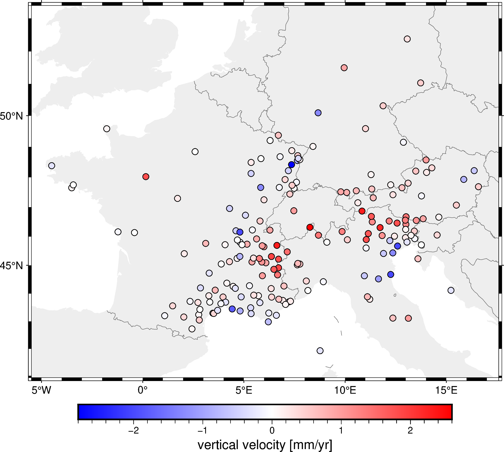
This is much better than just plotting the projected data with no context! Now we can see that the Alps region is moving upward (red dots) and the surrounding regions are moving downward (blue dots).
Projecting data#
For this region, a Mercator projection will do fine since we’re not too close to the poles and the latitude range isn’t very large. We’ll create a projection function and use to project the data coordinates.
projection = pyproj.Proj(proj="merc", lat_ts=data.latitude.mean())
coordinates = projection(data.longitude, data.latitude)
We’ve done this before in Making your first grid. We’ll still use the projected coordinates to decimate the data and fit the interpolator. What’s different is how we’ll use the interpolator to make a grid in geographic coordinates.
Fit an interpolator to the Cartesian data#
Use a Cartesian Spline to fit the data, like we did previously.
interpolator = vd.Spline().fit(coordinates, data.velocity_up_mmyr)
Now we can use this interpolator for gridding and predicting a profile.
Make a grid in geographic coordinates#
The interpolator is inherently Cartesian. If we wanted to use to generate a grid in geographic coordinates, we would have to:
Generate grid coordinates on a geographic system.
Project the grid coordinates to Cartesian.
Pass the projected coordinates to the
predictmethod of the interpolator.Generate an
xarray.Datasetwith the grid values and the geographic coordinates.
To facilitate this, the grid and profile methods of Verde interpolators
take a projection argument. If this is passed, Verde will do the steps
above and generate a grid/profile in geographic coordinates.
In this case, the region and spacing arguments must be given in
geographic coordinates.
grid = interpolator.grid(
    spacing=10 / 60,  # 10 arc-minutes in decimal degrees
    region=region,
    projection=projection,
    dims=("latitude", "longitude"),
    data_names="velocity_up",
)
grid
<xarray.Dataset> Size: 86kB
Dimensions:      (latitude: 76, longitude: 139)
Coordinates:
  * longitude    (longitude) float64 1kB -5.497 -5.329 -5.162 ... 17.42 17.58
  * latitude     (latitude) float64 608B 40.93 41.09 41.26 ... 53.05 53.21 53.38
Data variables:
    velocity_up  (latitude, longitude) float64 85kB -2.309 -2.283 ... -0.2871
Attributes:
metadata: Generated by Spline()Hint
Notice that we set the dims and data_names arguments above. Those
control the names of the coordinates and the data variables in the final
grid. It’s useful to set those to avoid Verde’s default names, which for
this case wouldn’t be appropriate.
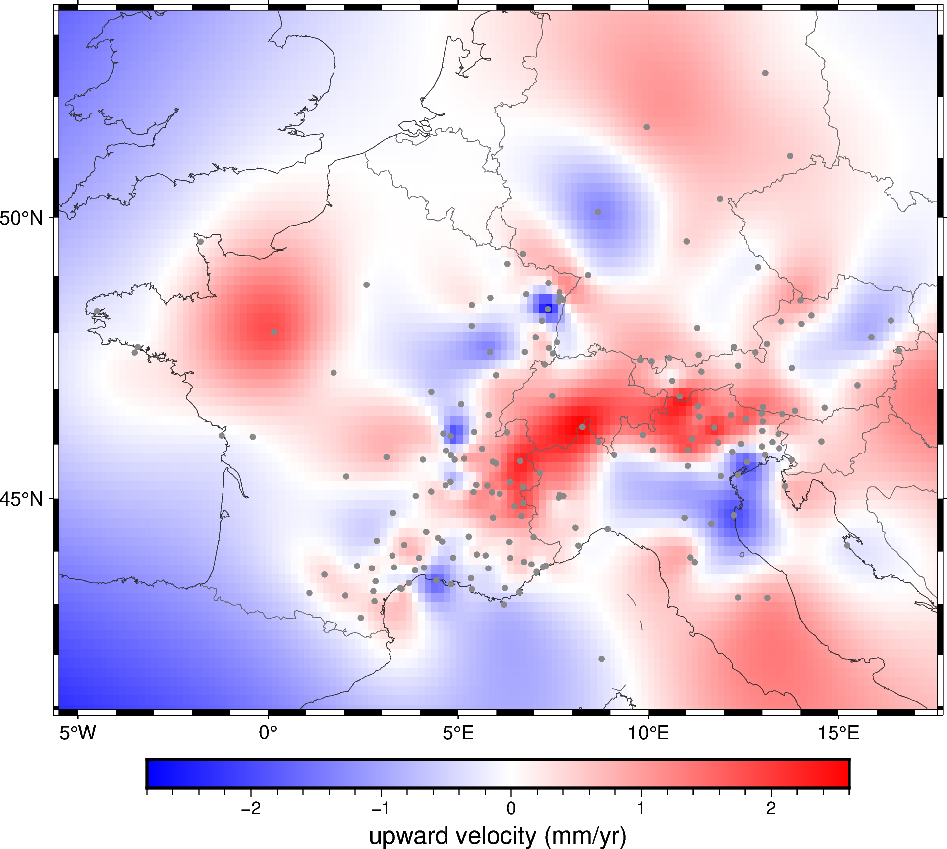
Notice that the grid has longitude and latitude coordinates and that they are evenly spaced. We can use this grid to plot a map of the vertical velocity with coastlines and country borders added.
fig = pygmt.Figure()
pygmt.makecpt(
    cmap="polar+h",
    series=[data.velocity_up_mmyr.min(), data.velocity_up_mmyr.max()],
)
fig.grdimage(
    grid.velocity_up,
    cmap=True,
    projection="M15c",
    frame="af",
)
fig.colorbar(frame='af+l"upward velocity (mm/yr)"')
fig.coast(
    shorelines="#333333", borders="1/#666666", area_thresh=1e4,
)
fig.plot(
    x=data.longitude,
    y=data.latitude,
    style="c0.1c",
    fill="#888888",
)
fig.show()
Make a profile in geographic coordinates#
Profiles in geographic coordinates would require a similar workflow to grids:
Project the geophysics coordinates of the points to Cartesian.
Generate the profile coordinates using the Cartesian points.
Pass the Cartesian profile coordinates to the
predictmethod of the interpolator.Convert the projected profile coordinates to geographic with an inverse projection.
Once again, we pass the projection argument to the profile method of
the interpolator and let it do the work for us.
profile = interpolator.profile(
    point1=(4, 51),  # longitude, latitude
    point2=(11, 42),
    size=200,  # number of points
    dims=("latitude", "longitude"),
    data_names="velocity_up",
    projection=projection,
)
profile
| latitude | longitude | distance | velocity_up | |
|---|---|---|---|---|
| 0 | 51.000000 | 4.000000 | 0.000000e+00 | -0.020266 |
| 1 | 50.958517 | 4.035176 | 5.776034e+03 | -0.018964 |
| 2 | 50.916997 | 4.070352 | 1.155207e+04 | -0.017694 |
| 3 | 50.875440 | 4.105528 | 1.732810e+04 | -0.016447 |
| 4 | 50.833845 | 4.140704 | 2.310414e+04 | -0.015208 |
| ... | ... | ... | ... | ... |
| 195 | 42.195756 | 10.859296 | 1.126327e+06 | 0.627948 |
| 196 | 42.146874 | 10.894472 | 1.132103e+06 | 0.642185 |
| 197 | 42.097954 | 10.929648 | 1.137879e+06 | 0.656719 |
| 198 | 42.048996 | 10.964824 | 1.143655e+06 | 0.671429 |
| 199 | 42.000000 | 11.000000 | 1.149431e+06 | 0.686197 |
200 rows × 4 columns
The output comes as a pandas.DataFrame with the longitude and latitude
coordinates of the points. The distance is calculated from the projected
coordinates and is not a great circle distance.
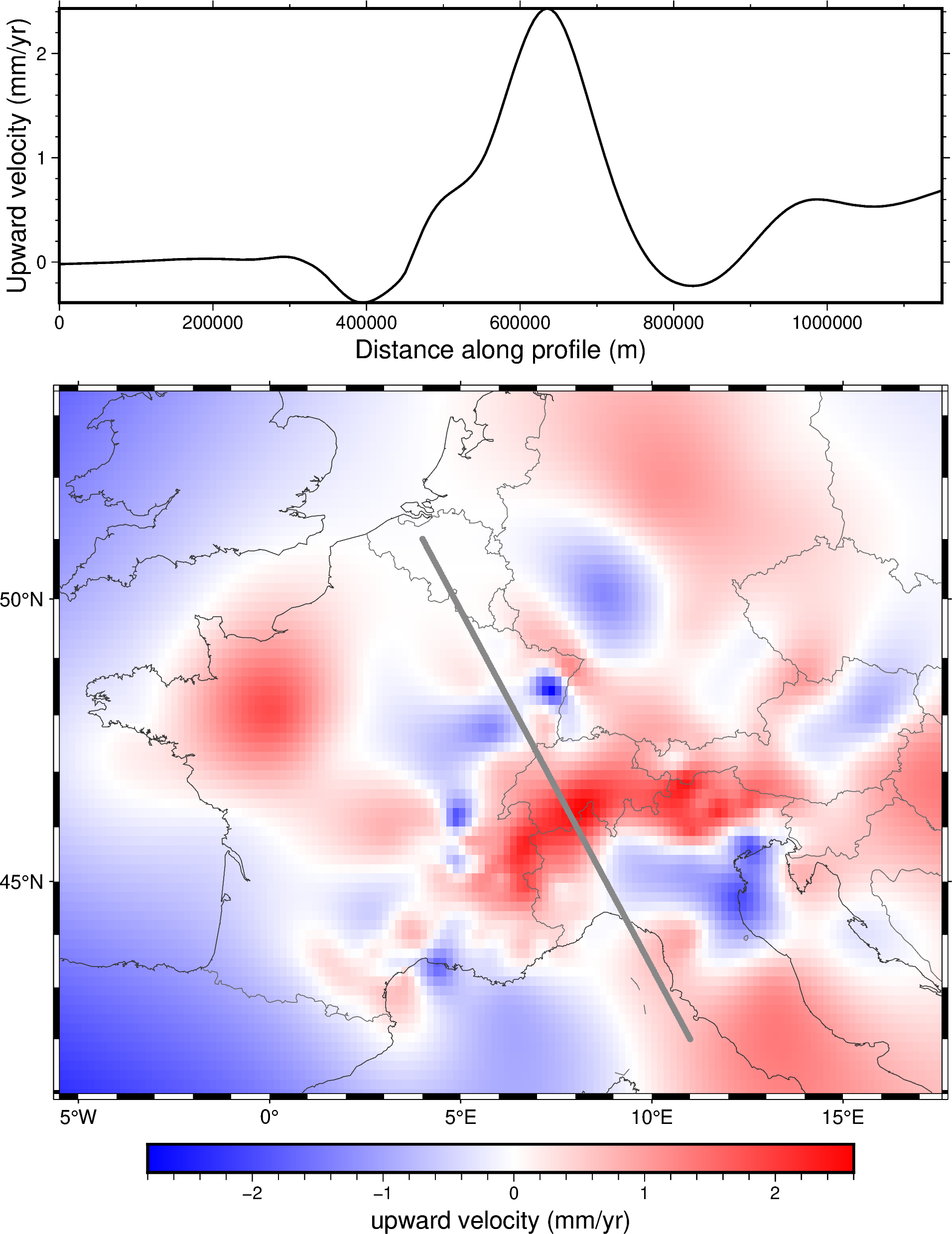
Lets plot the profile coordinates onto our map and the profile itself to see what it looks like:
fig = pygmt.Figure()
# Plot the grid
pygmt.makecpt(
    cmap="polar+h",
    series=[data.velocity_up_mmyr.min(), data.velocity_up_mmyr.max()],
)
fig.grdimage(grid.velocity_up, cmap=True, projection="M15c", frame="af")
fig.colorbar(frame='af+l"upward velocity (mm/yr)"')
fig.coast(shorelines="#333333", borders="1/#666666", area_thresh=1e4)
fig.plot(
    x=profile.longitude,
    y=profile.latitude,
    fill="#888888",
    style="c0.1c",
)
# Plot the profile above it
fig.shift_origin(yshift="h+1.5c")
fig.plot(
    x=profile.distance,
    y=profile.velocity_up,
    pen="1p",
    projection="X15c/5c",
    frame=["WSne", "xaf+lDistance along profile (m)", "yaf+lUpward velocity (mm/yr)"],
    region=vd.get_region((profile.distance, profile.velocity_up)),
)
fig.show()