Making your first grid#
This tutorial will take you through creating your first grid with Verde.
We’ll use one of our sample datasets to demonstrate how to use
verde.Spline to make a grid from relatively small datasets (fewer than
20,000 points).
Import what we need#
First thing to do is import all that we’ll need. As usual, we’ll import Verde
as vd. We’ll load the standard trio of data science in Python (numpy,
pandas, matplotlib) and some extra packages for geospatial data:
Ensaio which we use download sample
data, and pyproj to transform
our data from geographic to Cartesian coordinates.
import pandas as pd
import matplotlib.pyplot as plt

import ensaio
import pyproj

import verde as vd
Download and read in some data#
Now we can use function ensaio.fetch_alps_gps to download a sample
dataset for us to use.
This is a GPS dataset from stations along the Alps in Europe.
It contains the velocity with which each station was moving (in mm/year) and is
used for studies of plate tectonics.
path_to_data = ensaio.fetch_alps_gps(version=1)
print(path_to_data)
/home/runner/.cache/ensaio/v1/alps-gps-velocity.csv.xz
Ensaio downloads the data and returns a path to the data file on your computer.
Since this is a CSV file, we can load it with pandas.read_csv:
data = pd.read_csv(path_to_data)
data
| station_id | longitude | latitude | height_m | velocity_east_mmyr | velocity_north_mmyr | velocity_up_mmyr | longitude_error_m | latitude_error_m | height_error_m | velocity_east_error_mmyr | velocity_north_error_mmyr | velocity_up_error_mmyr | |
|---|---|---|---|---|---|---|---|---|---|---|---|---|---|
| 0 | ACOM | 13.514900 | 46.547935 | 1774.682 | 0.2 | 1.2 | 1.1 | 0.0005 | 0.0009 | 0.001 | 0.1 | 0.1 | 0.1 |
| 1 | AFAL | 12.174517 | 46.527144 | 2284.085 | -0.7 | 0.9 | 1.3 | 0.0009 | 0.0009 | 0.001 | 0.1 | 0.2 | 0.2 |
| 2 | AGDE | 3.466427 | 43.296383 | 65.785 | -0.2 | -0.2 | 0.1 | 0.0009 | 0.0018 | 0.002 | 0.1 | 0.3 | 0.3 |
| 3 | AGNE | 7.139620 | 45.467942 | 2354.600 | 0.0 | -0.2 | 1.5 | 0.0009 | 0.0036 | 0.004 | 0.2 | 0.6 | 0.5 |
| 4 | AIGL | 3.581261 | 44.121398 | 1618.764 | 0.0 | 0.1 | 0.7 | 0.0009 | 0.0009 | 0.002 | 0.1 | 0.5 | 0.5 |
| ... | ... | ... | ... | ... | ... | ... | ... | ... | ... | ... | ... | ... | ... |
| 181 | WLBH | 7.351299 | 48.415171 | 819.069 | 0.0 | -0.2 | -2.8 | 0.0005 | 0.0009 | 0.001 | 0.1 | 0.2 | 0.2 |
| 182 | WTZR | 12.878911 | 49.144199 | 666.025 | 0.1 | 0.2 | -0.1 | 0.0005 | 0.0005 | 0.001 | 0.1 | 0.1 | 0.1 |
| 183 | ZADA | 15.227590 | 44.113177 | 64.307 | 0.2 | 3.1 | -0.3 | 0.0018 | 0.0036 | 0.004 | 0.2 | 0.4 | 0.4 |
| 184 | ZIMM | 7.465278 | 46.877098 | 956.341 | -0.1 | 0.4 | 1.0 | 0.0005 | 0.0009 | 0.001 | 0.1 | 0.1 | 0.1 |
| 185 | ZOUF | 12.973553 | 46.557221 | 1946.508 | 0.1 | 1.0 | 1.3 | 0.0005 | 0.0009 | 0.001 | 0.1 | 0.1 | 0.1 |
186 rows × 13 columns
Convert from geographic to Cartesian#
Most interpolators and processing functions in Verde require Cartesian
coordinates.
So we can’t just provide them with the longitude and latitude in our datasets,
which would cause distortions in our results.
Instead, we’ll first project the data using pyproj.
We’ll use a Mercator projection because our area is far enough away from the
poles to cause any issues:
projection = pyproj.Proj(proj="merc", lat_ts=data.latitude.mean())
easting, northing = projection(data.longitude, data.latitude)
Now we have arrays with easting and northing coordinates in meters. Let’s plot this data with matplotlib to see what we’re dealing with:
fig, ax = plt.subplots(1, 1, figsize=(8, 5), layout="constrained")
# Set the aspect ratio to "equal" so that units in x and y match
ax.set_aspect("equal")
tmp = ax.scatter(easting, northing, c=data.velocity_up_mmyr, s=30)
fig.colorbar(tmp, label="mm/yr")
ax.set_title("Vertical velocity in the Alps measured by GPS")
ax.set_xlabel("easting (m)")
ax.set_ylabel("northing (m)")
plt.show()
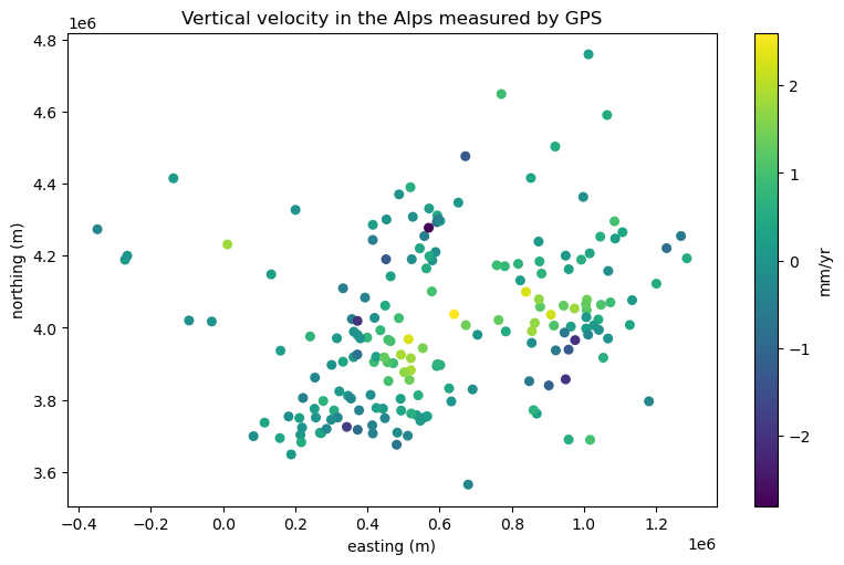
Our data has both positive (upward motion of the ground) and negative (downward
motion of the ground) values, which means that the default colormap used by
matplotlib isn’t ideal for our use case.
We should instead use a diverging colormap and make sure the minimum and
maximum values are adjusted to have the middle color map to the zero data
value.
Verde offers function verde.maxabs to help do this:
# Get the maximum absolute value
scale = vd.maxabs(data.velocity_up_mmyr)

fig, ax = plt.subplots(1, 1, figsize=(8, 5), layout="constrained")
ax.set_aspect("equal")
# Use scale to set the vmin and vmax and center the colorbar
tmp = ax.scatter(
    easting,
    northing,
    c=data.velocity_up_mmyr,
    s=30,
    cmap="RdBu_r",
    vmin=-scale,
    vmax=scale,
)
fig.colorbar(tmp, label="mm/yr")
ax.set_title("Vertical velocity in the Alps measured by GPS")
ax.set_xlabel("easting (m)")
ax.set_ylabel("northing (m)")
plt.show()
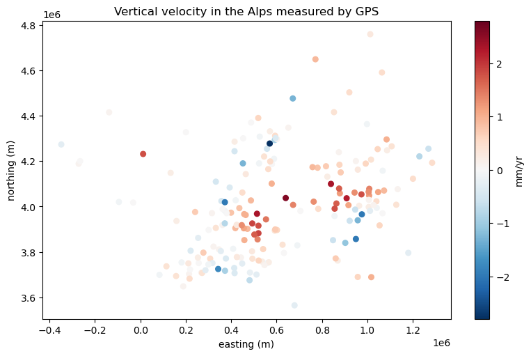
Now we can clearly see which points are going up and which ones are going down. That big region of upward motion are the Alps which are being pushed up by subduction. The surrounding regions tend to move downward by flexure caused by the Alps themselves and by the subduction as well.
Interpolation with bi-harmonic splines#
The verde.Spline class implements the bi-harmonic spline of
[Sandwell1987], which is a great method for interpolating smaller datasets
like ours (fewer than 20,000 data points).
It has a higher computation load than other methods but it allows use of data
weights and other neat features to control the smoothness of the solution.
To use it, we’ll first create an instance of verde.Spline:
spline = vd.Spline()
Now, we can fit it to our data. This will estimate a set of forces that push
on a thin elastic sheet to make it pass through our data.
The verde.Spline.fit method of all interpolators in Verde take the same
arguments: a tuple of coordinates and the corresponding data values (plus
optionally some weights).
The coordinates are always specified in easting and northing order
(think x and y on a plot).
spline.fit((easting, northing), data.velocity_up_mmyr)
Spline()In a Jupyter environment, please rerun this cell to show the HTML representation or trust the notebook.
On GitHub, the HTML representation is unable to render, please try loading this page with nbviewer.org.
Parameters
| damping | None | |
| force_coords | None | |
| parallel | True |
Fitting the spline is the most time consuming part of the interpolation.
But once the spline is fitted, we can use it to make predictions of the data
values wherever we wish by using the verde.Spline.predict method:
coordinates = (0.6e6, 4e6)  # easting, northing in meters
value = spline.predict(coordinates)
print(f"Vertical velocity at {coordinates}: {value} mm/yr")
Vertical velocity at (600000.0, 4000000.0): 2.161707015703996 mm/yr
Likewise, we can predict values on a regular grid with the
verde.Spline.grid method.
All it requires is a grid spacing (but it can also take other arguments):
grid = spline.grid(spacing=10e3)
grid
<xarray.Dataset> Size: 160kB
Dimensions:   (northing: 120, easting: 164)
Coordinates:
  * easting   (easting) float64 1kB -3.485e+05 -3.384e+05 ... 1.285e+06
  * northing  (northing) float64 960B 3.565e+06 3.575e+06 ... 4.758e+06
Data variables:
    scalars   (northing, easting) float64 157kB -1.852 -1.833 ... -0.1067
Attributes:
metadata: Generated by Spline()The generated grid is an xarray.Dataset which contains the grid
coordinates, interpolated values, and some metadata.
We can plot this grid with xarray’s plotting mechanics:
fig, ax = plt.subplots(1, 1, figsize=(8, 5), layout="constrained")
ax.set_aspect("equal")
grid.scalars.plot(ax=ax)
ax.set_title("Vertical velocity in the Alps measured by GPS")
ax.set_xlabel("easting (m)")
ax.set_ylabel("northing (m)")
plt.show()
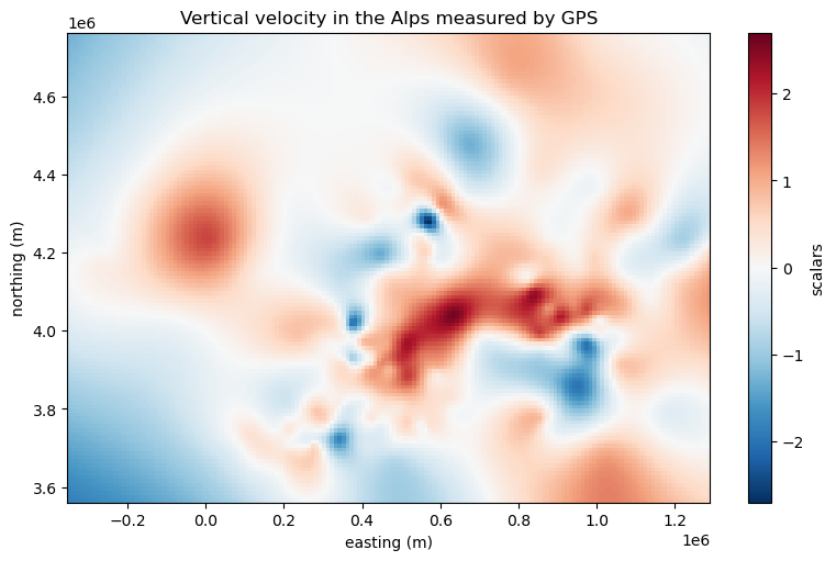
Notice that xarray handled choosing an appropriate colormap and centering it for us.
The plot and grid can be even better if we add more metadata to it, like the name of the data and its units.
# Rename the data variable and add some metadata
grid = grid.rename(scalars="velocity_up")
grid.velocity_up.attrs["long_name"] = "Vertical GPS velocity"
grid.velocity_up.attrs["units"] = "mm/yr"

# Make the plot again but plot the data locations on top
fig, ax = plt.subplots(1, 1, figsize=(8, 5), layout="constrained")
ax.set_aspect("equal")
grid.velocity_up.plot(ax=ax)
ax.plot(easting, northing, ".k", markersize=1)
ax.set_title("Vertical velocity in the Alps measured by GPS")
ax.set_xlabel("easting (m)")
ax.set_ylabel("northing (m)")
plt.show()
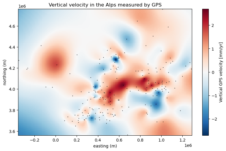
Notice how xarray automatically adds the data name and units to the colorbar
for us!
Finally, you can save the grid to a file with xarray.Dataset.to_netcdf
or other similar methods if you want.
🎉 Congratulations, you’ve made your first grid with Verde! 🎉